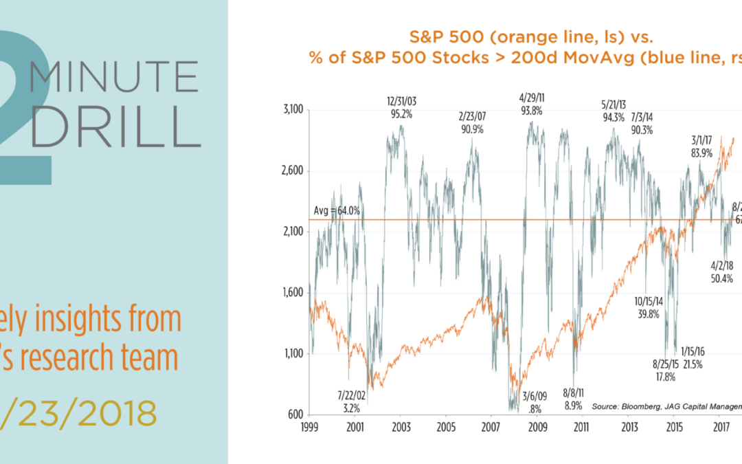
Some bearishly-inclined market commentators are making the case that equity market participation has narrowed in recent months. Their narrative holds that FANG-type stocks have continued to garner an abnormal amount of investor focus, and that most non-FANG stocks are not participating in the upside. The market is becoming uncomfortably narrow. We beg to differ, and in fact we find little evidence that market participation is unusually narrow or weak. Case in point: this chart measures the percentage of S&P 500 members above their 200 day moving averages. As one can see, the current reading of 67.3% is only marginally above its average since 1999, meaning that market participation is neither particularly broad or narrow from a historical standpoint. It is true that extremes in this indicator have often worked well as a contrary indicator in the past. Very high readings have often preceded short-term peaks in stock prices, while extremely low readings have often presaged short-term bottoms. However, non-extreme readings on either side of average – like the one we have now – have tended to accompany rallies in the S&P 500.

What about the technology-heavy Nasdaq? If the market is suffering from “FANG Fever,” in which only a few growth/tech stocks are participating in the market rally this year, wouldn’t this supposed divergence be particularly evident in the Nasdaq? Alas, we don’t see it. In fact, most of our comments about the previous chart addressing the S&P 500 also apply to this chart depicting the Nasdaq Composite. In this case, 54.0% of its constituents are above their respective 200-day moving averages, versus the long-term average of 52.9%. Again, we find it difficult to make a case for narrow market participation when the actual data shows that participation is at roughly average levels. It is always true that the equity market faces a variety of real and potential headwinds. That said, we do not currently see weak market participation as a clear and present danger to the continuation of the bull market.

Here we compare the NYSE Weekly Advance/Decline (AD) Line to S&P 500 price performance back to 1995. When the S&P 500 is rising, we like to see this price performance confirmed by a rising NYSE AD Line. This implies healthy market breadth, because an upward trajectory in the AD Line means that more individual stocks are participating in the broad market’s rally. On the other hand, higher stock prices accompanied by a declining AD Line create a “negative divergence,” because fewer individual stocks are rallying along with the broader market. This sort of “narrowing breadth” condition has often presaged stock market corrections.
Since 1995, the S&P 500 has experienced 8 declines of at least 12%. In 5 of these 8 instances, the S&P 500 was trading at an all-time high, but the NYSE Weekly Advance/Decline (AD) Line was below its trailing twelve-month peak. It is worth noting that the two most severe declines in the S&P over the past 20 years began on 3/24/00 and 10/12/07. In these cases, new stock market price highs had failed to be confirmed by new highs in the AD Line for 36 weeks and 13 weeks, respectively. The moral of the story: “negative divergences” in market breadth tend to precede market corrections, and the corrections tend to be more severe the longer the divergences persist.
Currently, the weekly NYSE AD Line is on a 12-month high, meaning that stock participation is relatively broad. At the margin, this makes us more bullish on stocks over the near- to intermediate term.
