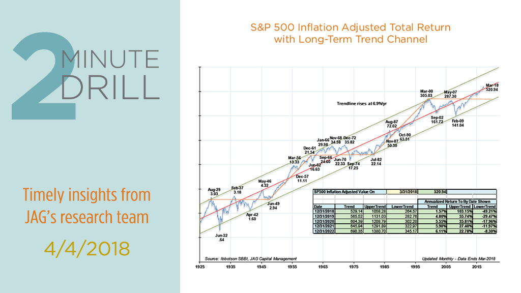
Amidst the recent market volatility, it helps to revisit the long-term case for investing in equities. This chart shows the inflation-adjusted (i.e. “real”) total return of the S&P 500 since 1926. The red trendline rises at a rate of 6.9% per year, representing the annualized real return of the S&P 500 over the past 92 years. Note that despite the gigantic gains reaped by investors since early 2009, real returns for stocks have only recently re-gained their long-term trend line. How is this possible? Partly because the last couple of decades have been decidedly mediocre for stock investors. To wit, we would point out that the S&P 500 has produced relatively paltry real annualized returns of roughly 2.7% since 1998, thanks largely to two big bear markets in the meantime. In that context, the rally since 2009 is a sign that stocks may still have some “catching up to do” in the next few years.

Timing the stock market is a mug’s game, but we find it helpful to keep track of market internals during periods of volatility. Our Overbought/Oversold Indicator has done a reasonably good job of highlighting extremes in investor sentiment over the years. Late last week, this indicator hit a level that implies the market is very oversold, which implies that (at least) the worst of the shorter-term selling pressure could be past. When we combine this data with strong economic statistics, full employment, healthy consumer sentiment, and continued strong corporate earnings, we are leaning more bullish than we were a few months ago.
